
What 'Cohesive' Actually Means in Home Décor - and How to Achieve It

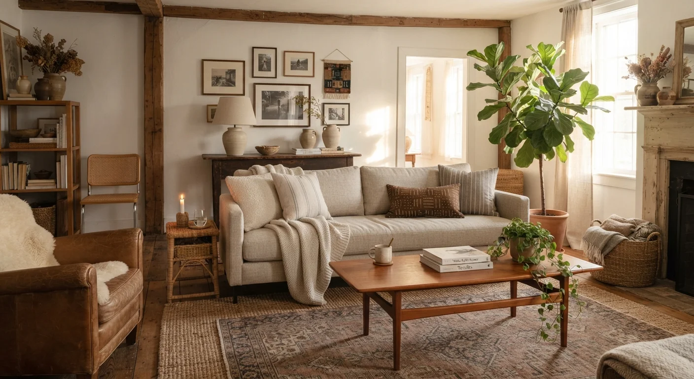
Photo: AscendWit.com | Explore Engaging Blogs. editorial
Key Takeaways
- Cohesion means intentional harmony, not identical matching across every piece.
- A limited color palette - typically two to four tones - is one of the most reliable anchors for cohesion.
- Repeating a material, finish, or texture at least three times creates a visual rhythm that unifies a room.
- Scale and proportion matter as much as color; mismatched sizing disrupts cohesion even when colors agree.
- A single unifying style thread keeps eclectic rooms from feeling chaotic.
Why 'Cohesive' Isn't the Same as 'Matching'
Walk into a furniture showroom and everything matches - same wood tone, same fabric family, same metal finish. It looks intentional, but it also feels flat. That's because matching and cohesion aren't the same thing. Cohesion is about visual harmony: the feeling that all the pieces in a room are in conversation with each other, even if they come from different sources, eras, or styles.
The distinction matters because many people hold back from decorating freely, fearing that mixing pieces will make a room look disjointed. In reality, rooms that feel alive and personal almost always contain a deliberate mix - what they share is an underlying logic that ties the mix together.
Understanding the principles behind that logic is the foundation of good decorating. The design principles behind every well-styled room - balance, scale, rhythm, and contrast - are the tools that make cohesion possible.
“A well-designed room isn't one where everything matches - it's one where everything belongs. The difference is intention.”
— A commonly expressed principle in interior design practice, Widely cited in professional interior design education and practice
The Four Levers of Cohesion
Designers rely on a small set of tools to tie a room together. You don't need to use all of them at once, but understanding each one gives you more control over how your space feels.
1. Color Palette
A shared color story is the most visible cohesion tool. Limit your palette to two to four tones per room - a dominant neutral for large surfaces, one or two supporting tones for furniture and soft furnishings, and an accent for smaller pieces. When the same hues appear in multiple spots around the room, the eye reads the space as unified.
2. Material and Finish Repetition
Repeating a material - natural oak, matte black metal, linen - at least two or three times in a room creates a visual rhythm without requiring everything to be identical. A wood dining table echoed in a wood picture frame and a small side stool reads as intentional. One lone wood piece in a room of chrome and glass reads as accidental.
3. Scale and Proportion
Even a perfectly coordinated color palette can feel off if the furniture scale is inconsistent. A massive sectional next to a tiny coffee table, or artwork that's too small for the wall it hangs on, creates visual tension that undermines cohesion. Aim for proportional relationships between pieces - and between furniture and the room's architecture.
4. Style Thread
A style thread is the underlying sensibility that connects your choices - whether that's a relaxed coastal vibe, a warm midcentury feel, or something more eclectic. You don't need to commit to a single defined style, but having a general direction prevents the room from pulling in too many incompatible directions at once. If you're unsure what style language resonates with you, the home décor style glossary can help you identify it.
60-30-10
Classic color ratio rule for room palettes
Interior designers commonly apply the 60-30-10 rule: 60% dominant neutral, 30% secondary color, 10% accent - a guideline taught in professional design programs.
3+
Times a material should repeat to feel intentional
Design educators and practitioners generally advise repeating a material or finish at least three times in a room to create a sense of visual rhythm rather than accident.
Practical Steps to Pull a Room Together
Knowing the theory is useful. Applying it to a room you already live in is the harder part. Here's a practical sequence for evaluating and improving cohesion in any space.
- Start with an audit. Stand in the doorway and look at the room as a whole. Note anything that immediately feels out of place - a color that appears only once, a piece that's significantly different in scale or finish from everything else.
- Identify your anchors. What are the room's fixed or large-investment elements - flooring, sofa, a large rug? These set the tone. Everything else should respond to them in at least one shared quality (color, texture, material).
- Edit before you add. Before buying anything new, remove pieces that don't belong. A room with fewer but better-integrated items always reads as more cohesive than one crowded with unrelated objects.
- Use a rug as a connector. A patterned rug that contains two or three of your palette colors is one of the fastest ways to tie disparate furniture pieces together. It literally places the colors in relationship to each other on the floor.
- Repeat intentionally. Once you've identified what's working, echo it. If your plant pots are terracotta, bring that warm tone into a throw pillow or candle. Repetition signals intention.
Edit First, Shop Second
If you're working with a smaller room, cohesion also interacts with how spacious the space feels - the approaches that make rooms feel larger can guide your choices there.
When Mixing Styles and Eras Still Works
Some of the most visually interesting rooms combine furniture from different decades, regions, or style families. This isn't a violation of cohesion - it's a more advanced expression of it. The key is ensuring the mix shares something: a color temperature (all warm tones, or all cool), a recurring material, or a consistent level of visual weight.
An antique wooden dresser alongside a modern bed frame works when both share a similar warm wood tone or when a unifying accent color - perhaps in the bedding or a lamp - bridges the gap. What breaks cohesion is contrast without connection: pieces that share nothing - not material, not tone, not scale, not style - placed side by side with no intentional bridge between them.
For more on making mixed furniture work intentionally, see our guide on mixing old and new furniture without it looking like a mistake. And if you're considering a bold feature like an accent wall to anchor a room's style, it's worth understanding when accent walls work and when they don't before committing.
Cohesion Works Across Rooms Too
Frequently Asked Questions
The content on this site is for informational purposes only and is not a substitute for professional advice. Always consult a qualified professional for guidance specific to your situation.