
The Design Principles Behind Every Well-Styled Room

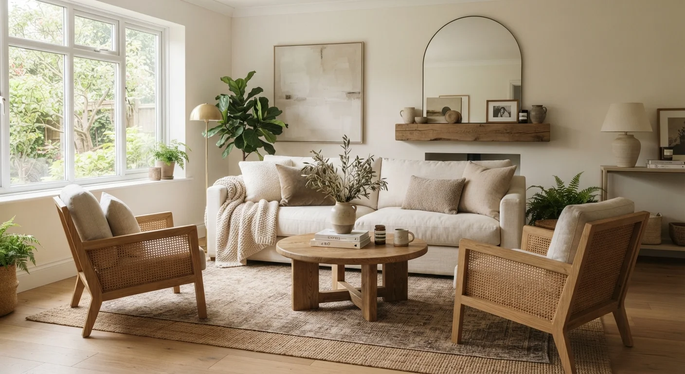
Photo: AscendWit.com | Explore Engaging Blogs. editorial
Key Takeaways
- Balance distributes visual weight evenly so a room doesn't feel lopsided or heavy on one side.
- Scale refers to how the size of objects relates to the room and to each other - mismatched scale is one of the most common styling mistakes.
- Contrast creates visual interest by pairing opposing elements like light and dark, rough and smooth.
- Rhythm in a room is achieved through repetition of color, shape, or pattern to guide the eye naturally.
- You don't need to apply every principle at once - mastering one or two can dramatically improve any space.
Why Design Principles Matter More Than Budget
Beautifully styled rooms aren't always expensive rooms. What separates a space that feels pulled-together from one that feels chaotic is usually the application of a few foundational ideas - principles that interior designers use instinctively but that anyone can learn. If you've ever stood in a room that felt somehow wrong despite having perfectly nice furniture, chances are one of these principles was being violated. Understanding them gives you a language for diagnosing problems and a set of tools for solving them.
If you're starting from a completely blank space, our beginner's guide to decorating a room from scratch walks you through decisions in a logical order before you bring any principles to bear.
Balance: Distributing Visual Weight
Balance is about how visual weight - the sense of heaviness or lightness that objects carry - is distributed across a room. A room that piles all its large, dark, or busy elements on one side will feel tilted, even if you can't immediately explain why.
There are two main types of balance designers work with:
- Symmetrical balance mirrors objects on either side of a central point - matching lamps flanking a bed is a classic example. It reads as formal and ordered.
- Asymmetrical balance achieves equilibrium using different objects of roughly equal visual weight - a tall plant on one side balanced by a lower but wider chair on the other. It feels more relaxed and contemporary.
Neither approach is superior; the choice depends on the mood you want the room to communicate. If your room currently feels off, these common imbalances and fixes are worth reviewing.
Test Balance Before You Commit
Scale and Proportion: Sizing Things Correctly
Scale refers to how the size of an object relates to the space around it and to other objects nearby. Proportion is the relationship between the parts of a single object. Together, they're responsible for some of the most common and fixable décor problems consumers face.
A rug that's too small for a seating area makes furniture look like it's floating disconnectedly. A floor lamp that barely clears the armrest of a sofa looks like a toy. A gallery wall of identical small frames on a large blank expanse looks timid. In each case, the issue is scale.
8×10 ft
Minimum rug size for most standard living rooms
Interior designers commonly recommend that an area rug in a living room be large enough for at least the front legs of all seating pieces to rest on it.
18-24 in
Recommended clearance between furniture pieces
The National Kitchen and Bath Association and general residential design guidelines suggest maintaining at least 18 inches of walking clearance in main traffic paths.
A useful habit: before purchasing a piece, measure your space and mark the proposed dimensions on the floor with painter's tape. What looks proportionate in a store showroom may read very differently in your home.
Contrast and Rhythm: Creating Interest and Flow
Contrast prevents a room from feeling flat. It's created by pairing opposing qualities - light against dark, smooth against rough, bold against neutral. A room decorated entirely in the same tone and texture becomes visually monotonous; introducing contrast adds dimension and energy. The key is intentionality: contrast should feel deliberate, not accidental. Pairing elements with a shared undertone or using a neutral to bridge the gap keeps contrast from tipping into chaos.
Color theory for renters and homeowners covers how undertones work and how to build a palette that holds together even when you're mixing contrasting elements.
Rhythm is about repetition and movement. When the eye encounters a color, shape, or material - then finds it again in another part of the room - it creates a sense of cohesion and intentional design. Repeating an accent color in three places (a pillow, a vase, a piece of art) is one of the simplest ways to establish rhythm without effort.
Putting the Principles Together
You don't need to apply all of these principles simultaneously or perfectly. In practice, even focusing on one - say, correcting the scale of your rug or introducing rhythmic color repetition - can noticeably improve how a room feels. Think of these principles as a diagnostic toolkit: when something feels wrong, run through balance, scale, contrast, and rhythm to identify which is out of alignment.
Design principles also work across every budget. Rearranging what you already own costs nothing. A correctly sized rug, a throw pillow that introduces contrast, or a plant that balances a heavy-looking side of a room can each be achieved affordably. The principles don't change based on what you spend - only the materials do.
“Design is not just what it looks like and feels like. Design is how it works.”
— Steve Jobs, Co-founder of Apple Inc., frequently cited in discussions of design philosophy
Frequently Asked Questions
The content on this site is for informational purposes only and is not a substitute for professional advice. Always consult a qualified professional for guidance specific to your situation.