
Accent Walls: When They Work and When They Don't

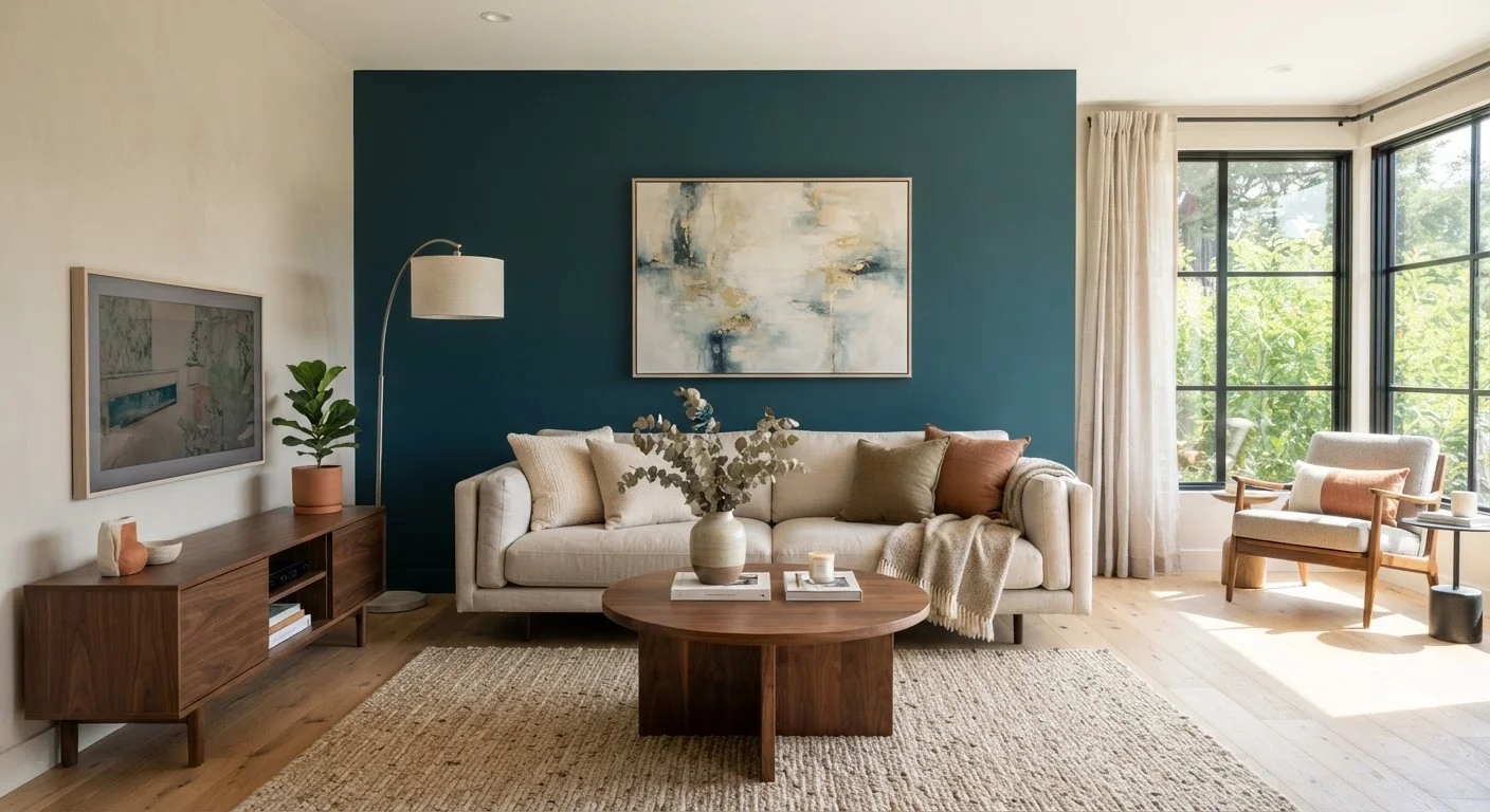
Photo: AscendWit.com | Explore Engaging Blogs. editorial
Key Takeaways
- Accent walls work best when they highlight an architectural feature or anchor a primary furniture arrangement.
- Color contrast, wall size, and room proportions all determine whether an accent wall helps or hurts.
- Dark or bold colors on the wrong wall can make a room feel smaller and unbalanced.
- Peel-and-stick wallpaper and paint are low-commitment ways to test the idea before committing.
- An accent wall should feel intentional - if you have to explain why that wall, reconsider.
Creates a clear visual focal point in the room
A well-placed accent wall gives the eye somewhere to land, which makes a room feel more composed and intentional rather than visually flat.
Allows bold color without overwhelming the space
Using a saturated or dark color on a single wall is far less risky than applying it to all four; you get the drama with an easier exit if tastes change.
Can define zones in open-plan spaces
A contrasting wall treatment signals a distinct area - dining, reading, or workspace - within a larger room without requiring dividers or furniture barriers.
Low-cost way to update a room's feel
A single wall requires less paint, wallpaper, or material than a full room, making it one of the more affordable ways to meaningfully change a space's character.
Can balance awkward room proportions
In rooms with very high ceilings, a darker accent wall can visually lower the ceiling and make the space feel more grounded and livable.
Wrong wall choice looks arbitrary and dated
An accent wall on a non-focal wall - especially a side wall with no furniture anchor - tends to look like a design afterthought rather than a deliberate choice.
Can shrink an already small room
Dark or high-contrast treatments absorb light and visually advance the wall toward the viewer, making tight spaces feel even more confined.
Difficult to execute in interrupted wall surfaces
Walls broken up by multiple doors, windows, outlets, or built-ins rarely read as clean accent surfaces - the treatment gets fragmented and loses its effect.
Color mismatch can destabilize the whole room
An accent color that fights with existing flooring, upholstery, or fixed finishes like cabinetry creates visual tension throughout the entire space rather than just on one wall.
Trendy treatments can feel quickly dated
Certain accent wall styles cycle through popularity rapidly; choosing a very trend-specific treatment over a more timeless approach may mean redecorating sooner than expected.
What an Accent Wall Is Actually Supposed to Do
An accent wall - sometimes called a feature wall - is a single wall in a room treated differently from the others, typically through a contrasting paint color, wallpaper, wood paneling, tile, or textured material. The design logic behind it is straightforward: draw the eye to a specific point in the room to create depth, hierarchy, and visual interest.
When it works, an accent wall functions similarly to other foundational design principles - it creates contrast and rhythm within a space. The goal is emphasis, not decoration for its own sake. If you'd like a broader look at how these principles operate together, see the design principles behind every well-styled room.
The concept became especially popular in the early 2000s and then fell out of fashion before returning in more refined forms. Today, the strongest accent walls tend to be more architectural - limewash plaster, fluted wood panels, textured grasscloth - rather than a single coat of a contrasting paint color.
When Accent Walls Actually Work
Creates a clear visual focal point in the room
A well-placed accent wall gives the eye somewhere to land, which makes a room feel more composed and intentional rather than visually flat.
Allows bold color without overwhelming the space
Using a saturated or dark color on a single wall is far less risky than applying it to all four; you get the drama with an easier exit if tastes change.
Can define zones in open-plan spaces
A contrasting wall treatment signals a distinct area - dining, reading, or workspace - within a larger room without requiring dividers or furniture barriers.
Low-cost way to update a room's feel
A single wall requires less paint, wallpaper, or material than a full room, making it one of the more affordable ways to meaningfully change a space's character.
Can balance awkward room proportions
In rooms with very high ceilings, a darker accent wall can visually lower the ceiling and make the space feel more grounded and livable.
The clearest case for an accent wall is a room that already has a natural focal point: a fireplace wall, the wall a bed is centered against, or the wall directly facing the entrance. These walls already carry visual weight - an accent treatment simply reinforces what the room is already doing.
Accent walls also help in open-plan spaces where you want to visually define a zone - a dining area within a larger great room, for example - without building physical walls. A different wall treatment signals separation without closing off the space.
In terms of color, a darker or more saturated hue on one wall can make a large, echoing room feel cozier and more contained. This works particularly well in rooms with high ceilings where the vertical space can feel disconnected from the furniture below.
When Accent Walls Backfire
Wrong wall choice looks arbitrary and dated
An accent wall on a non-focal wall - especially a side wall with no furniture anchor - tends to look like a design afterthought rather than a deliberate choice.
Can shrink an already small room
Dark or high-contrast treatments absorb light and visually advance the wall toward the viewer, making tight spaces feel even more confined.
Difficult to execute in interrupted wall surfaces
Walls broken up by multiple doors, windows, outlets, or built-ins rarely read as clean accent surfaces - the treatment gets fragmented and loses its effect.
Color mismatch can destabilize the whole room
An accent color that fights with existing flooring, upholstery, or fixed finishes like cabinetry creates visual tension throughout the entire space rather than just on one wall.
Trendy treatments can feel quickly dated
Certain accent wall styles cycle through popularity rapidly; choosing a very trend-specific treatment over a more timeless approach may mean redecorating sooner than expected.
The most common mistake is choosing the wrong wall. Painting a side wall - one that doesn't anchor furniture or face a natural sightline - tends to look random rather than intentional. The same applies to walls that are broken up by too many windows, doors, or vents; the treatment gets interrupted and loses its impact.
Small rooms are particularly risky territory. A bold or dark accent wall in an already tight space can compress the room further rather than adding character. If you're navigating a smaller room, it's worth reading about décor approaches that make rooms feel larger before committing to any accent treatment.
Undertones Matter More Than You Think
Color that clashes with existing furniture, flooring, or fixed finishes - like tile or cabinetry - is another common failure point. An accent wall doesn't exist in isolation; it needs to connect to the rest of the room through tone, undertone, or material relationship.
Choosing the Right Treatment and Wall
1 wall
Ideal scope for an accent treatment
Design guidance consistently points to limiting the treatment to a single, architecturally meaningful wall to preserve balance in the room.
60-30-10
Classic interior color distribution rule
The 60-30-10 rule - dominant color, secondary color, accent - is a widely taught interior design framework; an accent wall typically falls within the 10% accent category.
Before selecting a color or material, stand in the room and identify which wall the eye naturally goes to first. That's your candidate. Then ask whether the wall is relatively uninterrupted - ideally no more than one or two openings - and whether your furniture arrangement points toward it.
For treatment, paint is the lowest-risk starting point. Peel-and-stick wallpaper has improved considerably in quality and is a practical way to test a pattern or texture before investing in traditional wallpaper or a more permanent material like paneling or tile. Both allow you to course-correct without a major renovation.
If you're starting a room from scratch and aren't sure where an accent wall fits into the broader plan, decorating a room from scratch offers a logical sequencing guide. Similarly, the wall treatment you choose will interact with your lighting - see how ambient, task, and accent light shape a room for how light affects color and texture perception on walls.
One alternative worth considering: a gallery wall can achieve a similar focal-point effect on the same wall without any paint or permanent commitment.
The content on this site is for informational purposes only and is not a substitute for professional advice. Always consult a qualified professional for guidance specific to your situation.