
Styling a Gallery Wall Without Guesswork

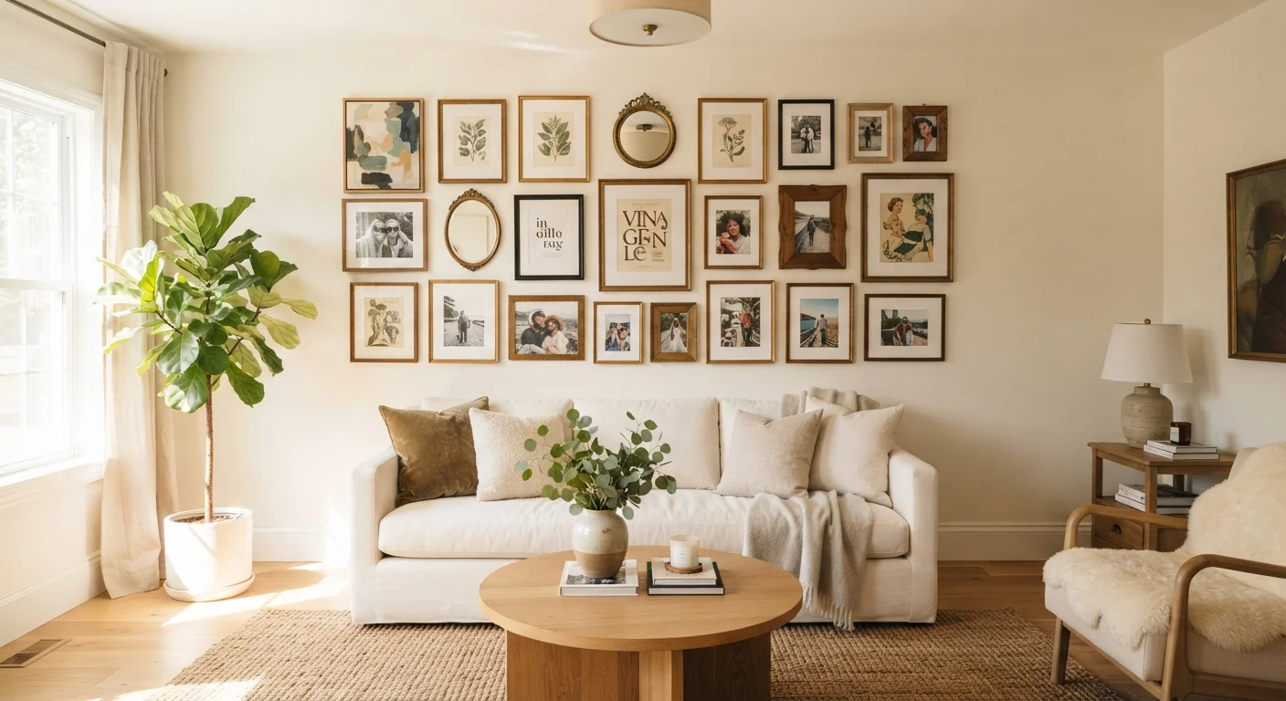
Photo: AscendWit.com | Explore Engaging Blogs. editorial
Key Takeaways
- Planning your layout on paper or the floor before hammering any nails saves time and reduces wall damage.
- Consistent spacing - typically 2 to 3 inches between frames - creates visual order regardless of frame variety.
- An anchor piece placed first gives the rest of the arrangement a reliable reference point.
- Gallery walls work best when hung so the center of the arrangement sits at eye level, around 57-60 inches from the floor.
- Mixing frame sizes, finishes, or subject matter is intentional - just ensure a unifying thread ties pieces together.
Why Gallery Walls Go Wrong - and How to Avoid It
Gallery walls fail most often for one of three reasons: inconsistent spacing that reads as rushed, a lack of any unifying element that makes the collection feel random, or placement that ignores the room's sightlines. The good news is that all three are planning problems, not hanging problems - meaning they're entirely preventable before a single nail enters the wall.
Don't Skip the Unifying Thread
Spacing is the detail most people underestimate. Gaps that vary between 1 inch and 5 inches across the same arrangement create visual restlessness. Commit to a consistent gap and use it throughout. If you're working within a larger room-décor context, it helps to run through a room planning checklist before you start shopping for frames or prints.
Wall placement also matters more than most guides acknowledge. A gallery wall hung too high - a common mistake - disconnects from the furniture below it and makes ceilings feel lower. Too low and it reads as an afterthought. The 57-60 inch center-of-arrangement rule comes from the average hanging height used in professional galleries, and it holds up well in most residential settings. If something in your room still feels off even after careful hanging, these common layout imbalances and corrections may point you toward the fix.
Building the Arrangement: Tools, Layout, and Hanging
A gallery wall project breaks into three distinct phases: planning the composition, preparing the wall, and doing the actual hanging. Rushing the first phase is what causes most rework.
What you will need
Start by gathering your tools before anything goes on the wall.
Tape measure
Measure wall dimensions and mark consistent spacing between frames.
Painter's tape
Map out frame positions on the wall before committing to nails.
Level
Ensure individual frames and the overall arrangement hang straight.
Craft paper or newspaper
Trace frame outlines to create paper templates for layout testing on the wall.
Picture hooks and wall anchors
Securely mount frames; anchor type depends on wall material and frame weight.
Pencil
Mark hook positions lightly; erases cleanly once frames are hung.
With tools ready, follow the steps below. The paper template method described in step 4 is especially worth the extra few minutes - it dramatically reduces the number of unnecessary nail holes.
Decide on a layout style
Gallery walls generally follow one of three approaches: grid layouts (uniform frames in even rows and columns), salon-style (varied sizes arranged organically), or linear arrangements (a single horizontal or vertical row). Grid layouts are forgiving and look intentional even with minimal design experience. Salon-style arrangements offer more creative freedom but require a stronger unifying element to avoid visual noise.
Consider the wall's shape and what sits beneath it. A grid suits a symmetrical space like a hallway; salon-style often works above a sofa or console table where the furniture anchors the arrangement visually. Understanding basic design principles like balance and scale will help you choose which approach suits your space.
Gather and edit your pieces
Lay all your candidate frames, prints, and objects flat on the floor. Step back and look at them together. Remove anything that disrupts the shared thread you've identified - a black-and-white photography collection doesn't need a bright pop-art print unless you're intentionally building contrast. Aim for an odd number of pieces in casual arrangements; even numbers work well in grids.
If your frames are mismatched in finish, consider spray-painting them a single color for cohesion. Alternatively, lean into the variety but keep mats consistent. For more on blending different styles deliberately, see our guide on mixing old and new elements without it looking accidental.
Arrange the layout on the floor
Recreate your wall's dimensions on the floor using painter's tape as a boundary. Arrange all frames within this footprint, experimenting with placement until the composition feels balanced. Place your largest or most visually dominant piece - your anchor - near the center, then build outward. Keep gaps consistent: 2-3 inches between frames is a reliable starting point.
Photograph the floor arrangement from above before moving anything. This image becomes your reference during installation.
Transfer the layout to the wall
Trace each frame onto craft paper, cut out the template, and label it with the frame's name or a number matching your photo. Tape the templates to the wall with painter's tape, starting with the anchor piece and working outward - exactly as you arranged them on the floor.
Step back frequently to assess from a distance. Walls can make arrangements feel tighter or more spread out than floors do. Adjust template positions until you're satisfied before marking any nail holes.
Mark, hang, and level each frame
With templates still in place, mark the nail or hook position through each template using a pencil. Remove the paper, install your hooks or anchors, then hang each frame. Use a level after placing each piece - even a slight tilt becomes obvious once the wall is full. The center of your entire arrangement should sit roughly 57-60 inches from the floor, which places it at average eye level.
After all frames are hung, do a final check from across the room. Small adjustments are easier to make now than after you've started decorating around the wall.
Know Your Wall Before You Drill
Once your wall is complete, take a moment to consider how it relates to the rest of the room. A gallery wall is a strong focal point, and it should work with - not compete against - other visual anchors in the space. If you're working with a deliberate color palette, use mat colors or frame finishes that echo tones already present in the room. For rooms where the gallery wall might share visual weight with a painted feature wall, understanding when accent walls help or hurt can prevent one element from overpowering the other.
The content on this site is for informational purposes only and is not a substitute for professional advice. Always consult a qualified professional for guidance specific to your situation.