
Color Theory for Renters and Homeowners Who Aren't Designers

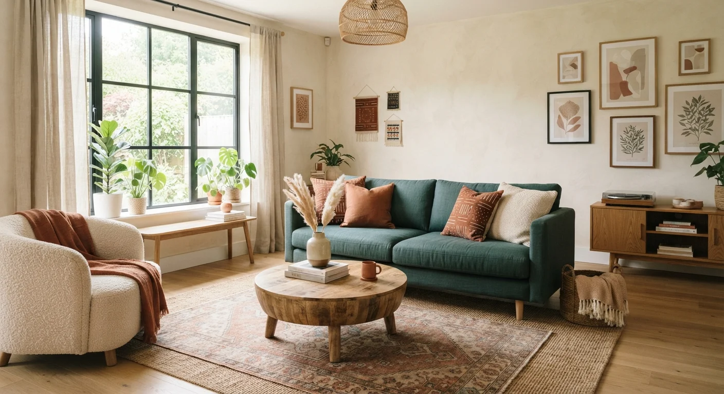
Photo: AscendWit.com | Explore Engaging Blogs. editorial
Key Takeaways
- Warm tones energize a space; cool tones calm it - choosing deliberately changes how a room feels.
- Undertones in paint and fabric can clash subtly even when the main colors seem to match.
- The 60-30-10 rule gives any room a proportional, balanced color distribution.
- Renters can apply color theory through textiles, furniture, and removable décor without touching walls.
- Starting with one anchor piece - like a rug or sofa - makes palette-building much more manageable.
Why Color Theory Actually Matters at Home
Color theory sounds like something reserved for art school - but at its core it's just a set of observations about how colors interact and how they affect the way we feel in a space. You don't need to memorize a color wheel to use these ideas. You just need to understand a handful of principles that explain why some rooms feel effortlessly cohesive and others feel off, even when the furniture is nice.
The good news: these principles work whether you own your home or rent it, and whether your budget is modest or generous. See our design principles guide for the broader framework that color fits into.
Color temperature
A description of whether a color reads as warm (red, orange, yellow) or cool (blue, green, purple). Temperature affects the mood and perceived size of a space.
Undertone
The subtle secondary hue beneath a color's main appearance - for example, a gray with a slight blue or purple cast. Undertones determine whether colors from different families will harmonize or clash.
60-30-10 rule
A proportional guideline that divides a room's color into three roles: 60% dominant (walls/main furniture), 30% secondary (upholstery/rugs), and 10% accent (accessories/art).
Color palette
A curated set of three to five colors chosen to work together throughout a room or home. A palette ensures visual cohesion across different materials and surfaces.
Saturation
How vivid or muted a color is. Highly saturated colors are intense and bold; desaturated (muted) versions of the same color feel softer and easier to live with in large amounts.
Warm, Cool, and Neutral: Understanding Tone
Every color belongs somewhere on a spectrum from warm to cool. Warm colors - reds, oranges, yellows, warm tans and browns - tend to feel energizing, cozy, and visually advancing (they seem to come toward you). Cool colors - blues, greens, blue-purples - feel calming and spatially receding (they push the walls back visually).
Neutrals - whites, grays, beiges, and blacks - sit in the middle, but they're not truly colorless. Every neutral leans warm or cool depending on its undertones, which is where many decorating mistakes happen.
A practical starting point: decide whether you want a room to feel energizing or restful, then let that guide whether you lean warm or cool. Most successful rooms use both - one family dominates, the other provides contrast.
Undertones: The Hidden Variable That Trips People Up
An undertone is the subtle secondary hue lurking beneath a color's surface. A white paint can read slightly pink, yellow, or green depending on its undertone. A gray can lean blue or purple. This is why two shades that both look like "greige" on a small chip can clash dramatically once on your walls next to your existing furniture.
To spot undertones, always view paint swatches in natural daylight, and hold them against a pure white reference. Compare at least two similar shades side by side - the difference becomes obvious quickly. The same principle applies to fabric: a warm cream sofa will fight a cool gray rug even though both seem neutral.
Test Paint Swatches Before You Commit
When building a palette, decide early whether your scheme will run warm or cool overall, then make sure your neutrals' undertones align with that direction. Mixing undertone families without intention is the most common reason a room feels subtly wrong.
The 60-30-10 Rule Explained
The 60-30-10 rule is a simple formula designers use to distribute color proportionally throughout a room:
- 60% - dominant color: Usually the walls, or the largest piece of furniture if walls are white. This is your anchor.
- 30% - secondary color: Upholstery, curtains, or a large area rug. It should complement the dominant without competing.
- 10% - accent color: Throw pillows, artwork, vases, lamps. This is where you can introduce something bold or unexpected.
The ratio isn't rigid, but the logic behind it is: too much of the accent color makes a room feel chaotic; too little of the secondary leaves it flat. Think of the accent as seasoning - a little goes a long way.
For a concrete example: soft warm white walls (60%), a dusty sage green sofa (30%), and terracotta ceramic accents (10%). Each color is distinct, but the warm undertones running through all three tie them together.
Building Your Palette: A Practical Starting Point
The easiest way to start is to anchor your palette to one piece you already own and love - often a rug, a sofa, or a piece of art. Pull three to four colors from it: the dominant, a supporting tone, and one accent. You've essentially reverse-engineered a palette that already works.
If you're starting from scratch, look at the home décor style glossary to identify the visual direction you're drawn to - then research the color families typically associated with that style. Coastal rooms lean cool and light; midcentury modern often pairs warm wood tones with muted, earthy hues.
Once you have a direction, limit yourself to three to four colors maximum. More than that tends to create visual noise rather than richness. You can vary the shades and saturation within each color family to add depth without adding chaos.
Varying Shades Adds Depth Without Complexity
Color Tips for Renters with Limitations
If you can't paint, your walls become the fixed 60% - and your job is to work with them rather than against them. First, identify the undertone of your walls. If they're a cool, slightly blue-gray white, bring in cool-leaning textiles and furniture. Fighting the undertone with warm-heavy accessories tends to make the whole room look muddy.
Textiles carry surprising color weight: a large area rug, floor-length curtains, and a statement sofa collectively do most of the heavy lifting. Swap throw pillows seasonally to shift the accent 10% without any commitment. Artwork and gallery arrangements also let you introduce bold color in a completely removable way - see our gallery wall guide for layout ideas.
For renters considering temporary accent solutions, our article on when accent walls work covers peel-and-stick options and what makes them succeed or fail. And for a broader look at what's truly reversible, renting and still decorating is worth a read before you commit to anything.
Frequently Asked Questions
The content on this site is for informational purposes only and is not a substitute for professional advice. Always consult a qualified professional for guidance specific to your situation.